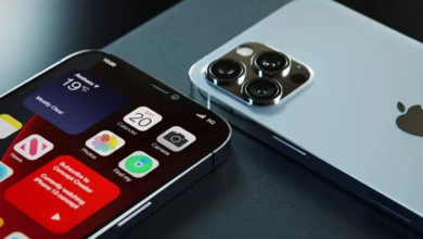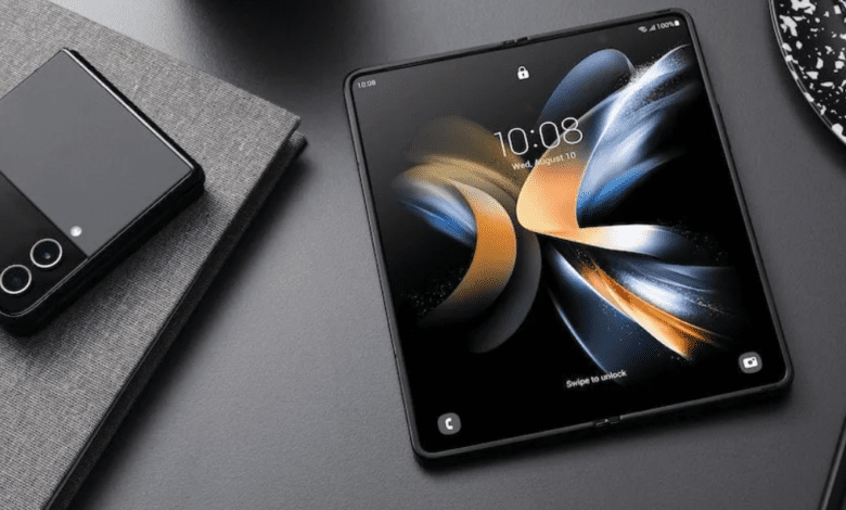

The Galaxy Z Flip 4 is also one of the best realizations of Samsung’s folding phone aesthetic to date. Opening it to reveal the large 6.7-inch OLED screen still feels like magic. Its compact pocket size is a welcome relief from massive phones, and its attractive design still very much turns heads.
It’s the “have your cake and eat it too” of smartphones.
With the plethora of color options and the tiny size, we can definitely see how this will be a favorite among those looking for a compact phone and those nostalgic for the good old clamshell phones of the past.
The Flip 4 does come at a flagship cost, but it is not prohibitively expensive like the Fold 4, so it is not out of reach either. And this being the fourth generation of a product is reassuring as you know that initial pain points have been addressed and the device will be able to withstand the stress of daily use.
The big new addition to Flex Mode is that it gets a trackpad and a tiny cursor. You can click buttons and open menus with the world’s tiniest cursor, or use two fingers to swipe and move around like exploring street view in Google Maps. This trackpad seems like a novel idea, but in actual use, it’s not very practical.


There’s something about the Samsung Galaxy Z Fold 4 that makes me feel more powerful and productive when I’m using it. Maybe it’s the new taskbar that makes multitasking a breeze or the ability to run apps side by side and drag and drop content between windows.
The Samsung Galaxy Z Fold 4 is a fine evolution of the best foldable phone. It costs $1,800. Yes, that’s a lot of gravy. Most of that price comes from the Z Fold 4’s 7.6-inch foldable display.
The folding mechanism feels strong and built to last. In fact, Samsung promises the device will survive a minimum of 200,000 folds. While it is very much a two-handed activity to open the phone, it is easy to do and closes again with a satisfying click thanks to inbuilt magnets.
Both the selfie cameras work as you would expect. There’s one on the cover screen, and a second one on the main screen, hidden under an array of pixels to make it blend in with the screen. The camera on the cover screen performed much better, but both work well for calls and quick photos to send people.
But know that not all apps are optimized for the Galaxy Z Fold 4. For example, Instagram awkwardly floats in the middle of the screen with arrows on either side to align it on the left or right.


